creamy låme
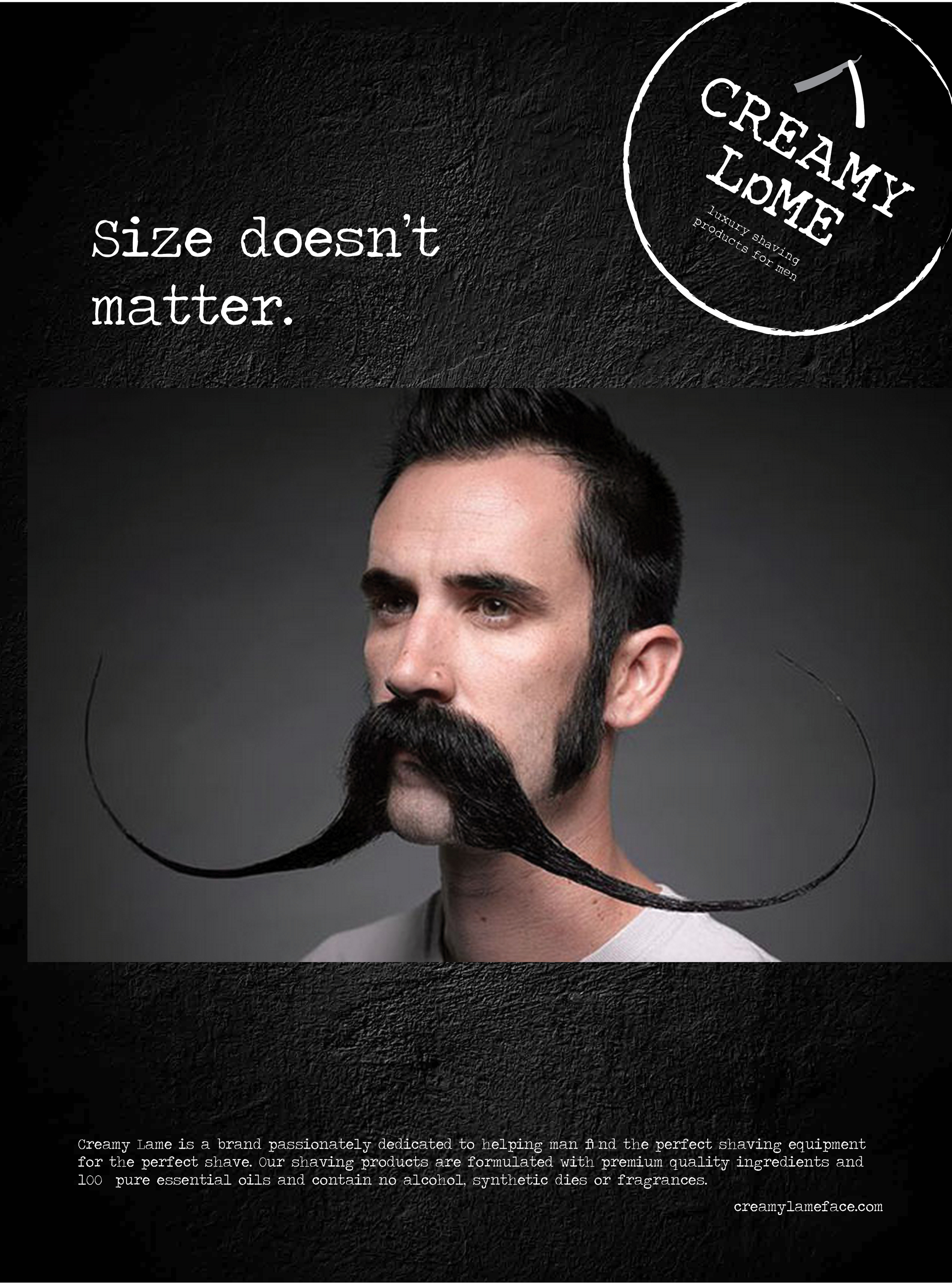
- This was a class project where the professor had each student draw two pieces of paper out of her hand. On each paper, there was a word. Each student had to create a branding campaign for a business that wasnamed by the two words that each student drew. I picked the words creamy and lame. (It is definitely fair to say I recieved the worst combination of all the classmates.) I had trouble coming up with a business named Creamy Lame or Lame Creamy. Therefore, I began to explore the translations of these words, hoping to come up with a better solution for my business. I found that "lame" in French means "blade." With that information, I created a branding campaign for a men's luxury shaving company. I wanted my target audience to be men from their early twenties all the way to their mid-thirties to forties. I wanted the brand to be vintage, yet classic, while still intriguing to the more "laid-back, easy-going" type. I created the ads and logo to be a little rough, yet humerous, and topped it off with a little sexual inuendo.
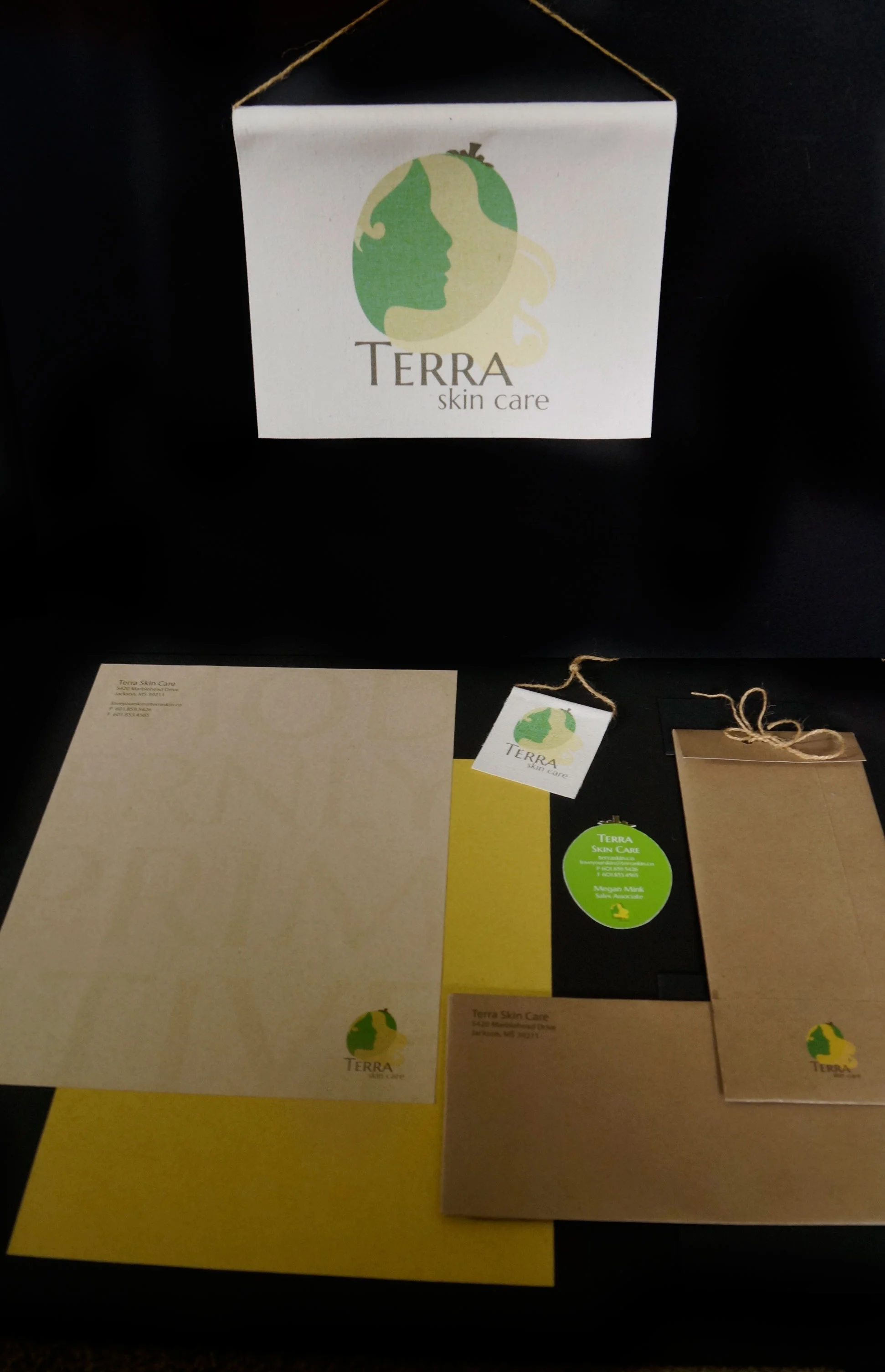
terra skin care
"modernly primitive"
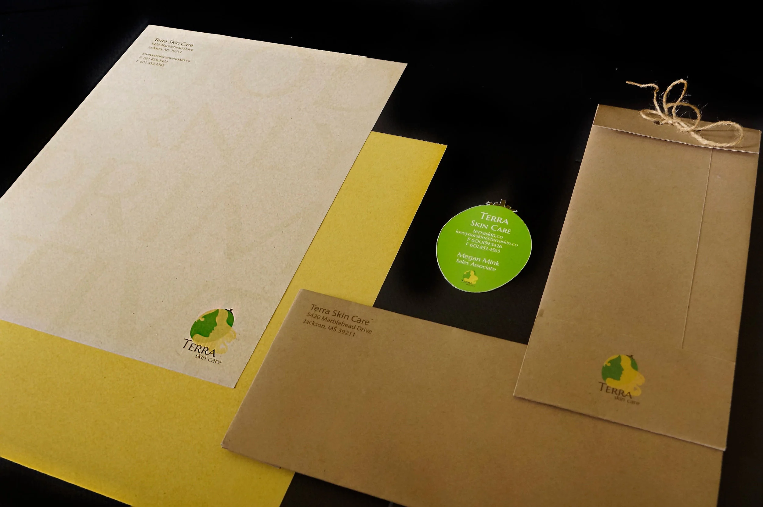
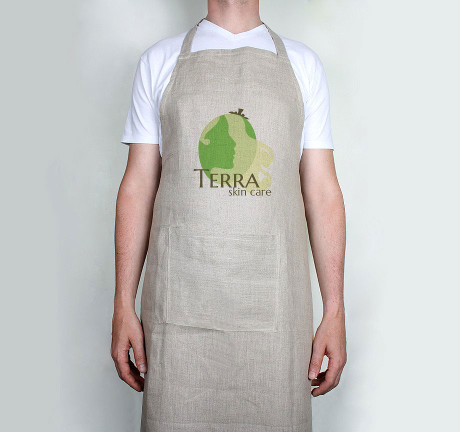
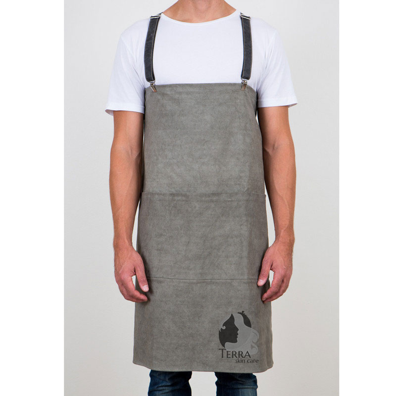
- This is a branding project for a natural skin care company that uses only the most natural, unfilteredproducts. The primary crop for this company was the shea tree, so the logo and stationary are designed toshow the characteristics of the shea nut. When you open the stationary, the colors represent the layers ofthe shea nut as if you were cracking a shea nut open yourself. The stationary and tags are printed onnatural paper and canvas and are completely and easily biodegradable.
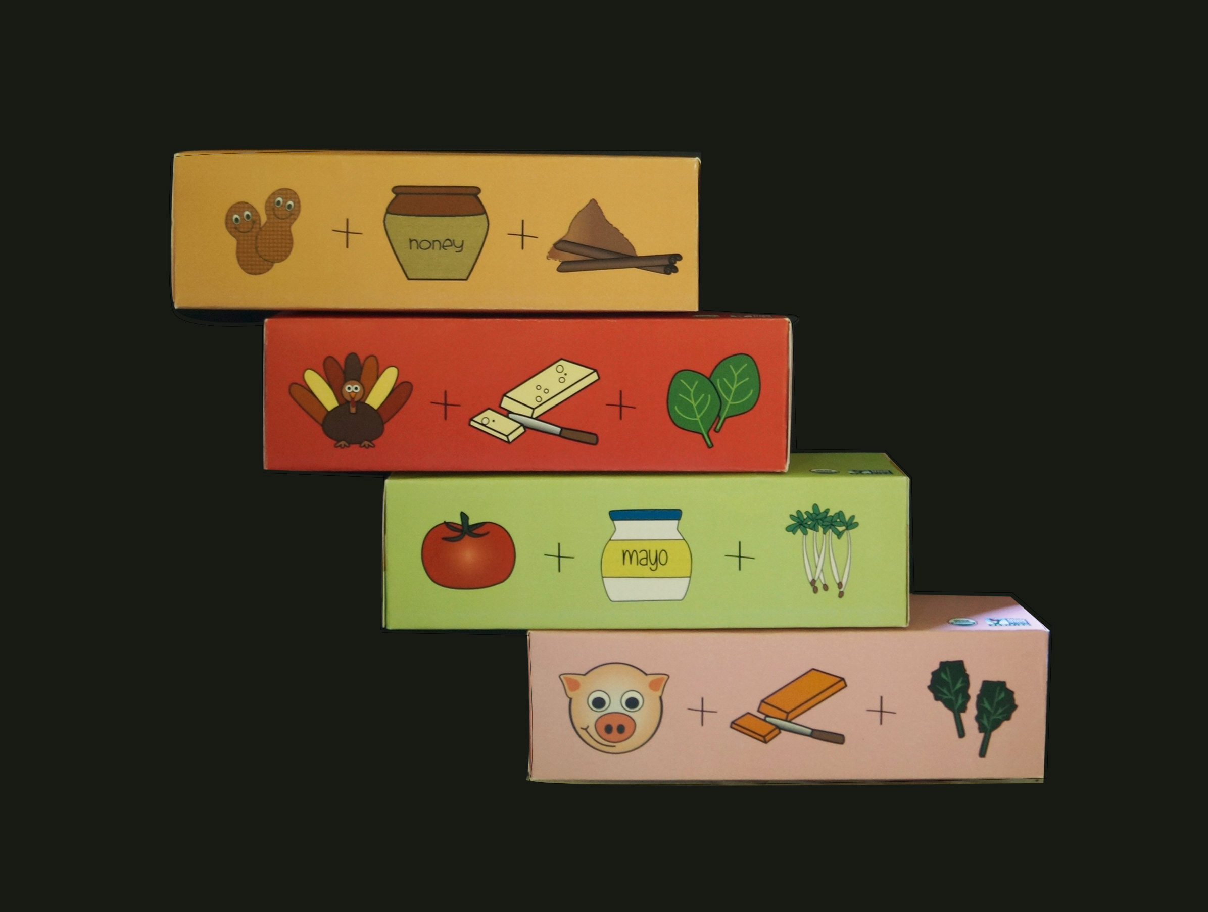
sammy's
"little sandwiches for little fingers"
- Sammy's is a children's food product made with only the most natural of ingredients. As the logo shows, each box will contain a row of sandwich triangles in one of four different flavors. By using common, yet bold colors found in nature, and simplistic designs that are pleasing to the eyes of both children and adults, this could be a popular choice chosen by both the parent and child.

